

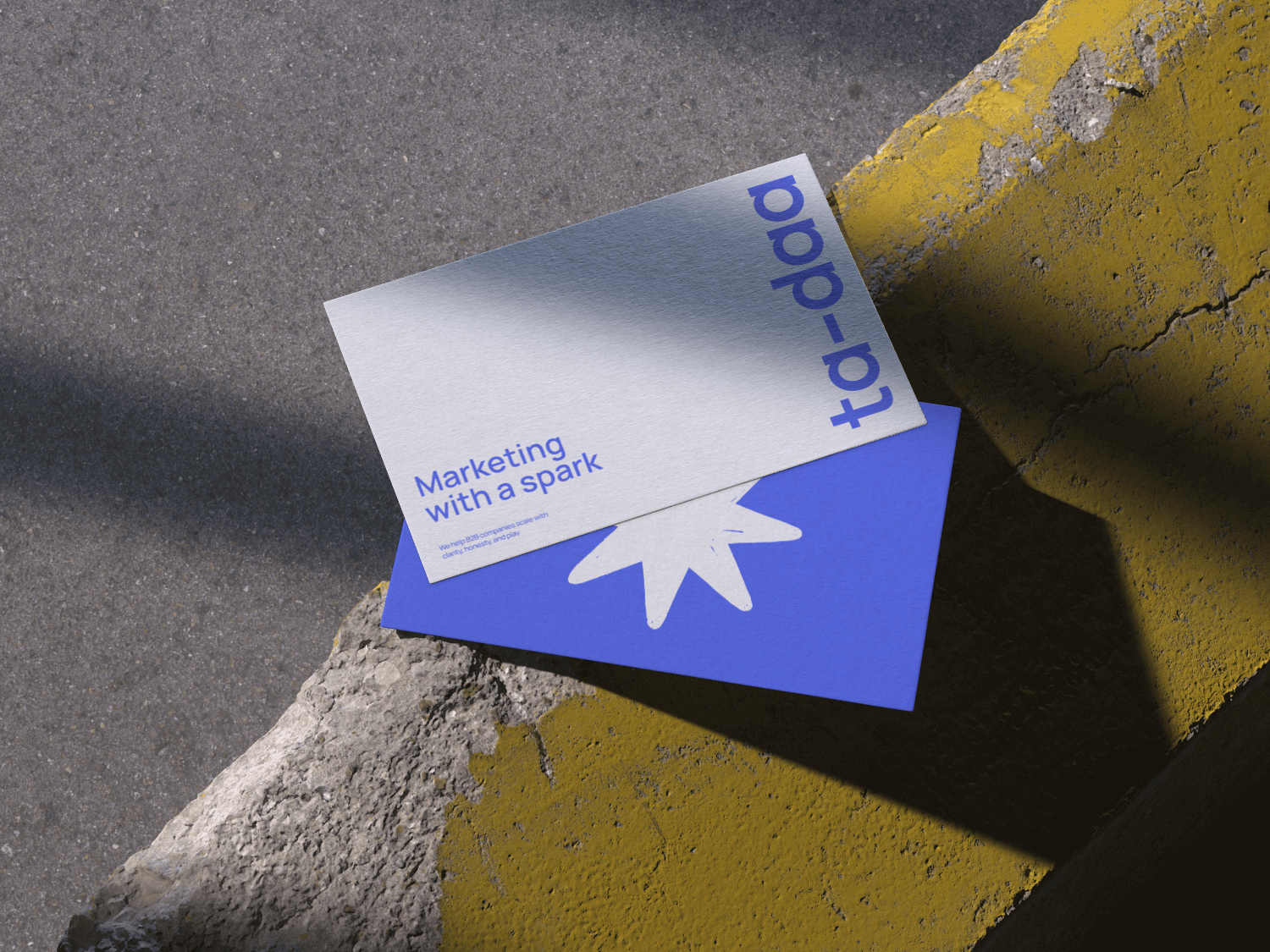
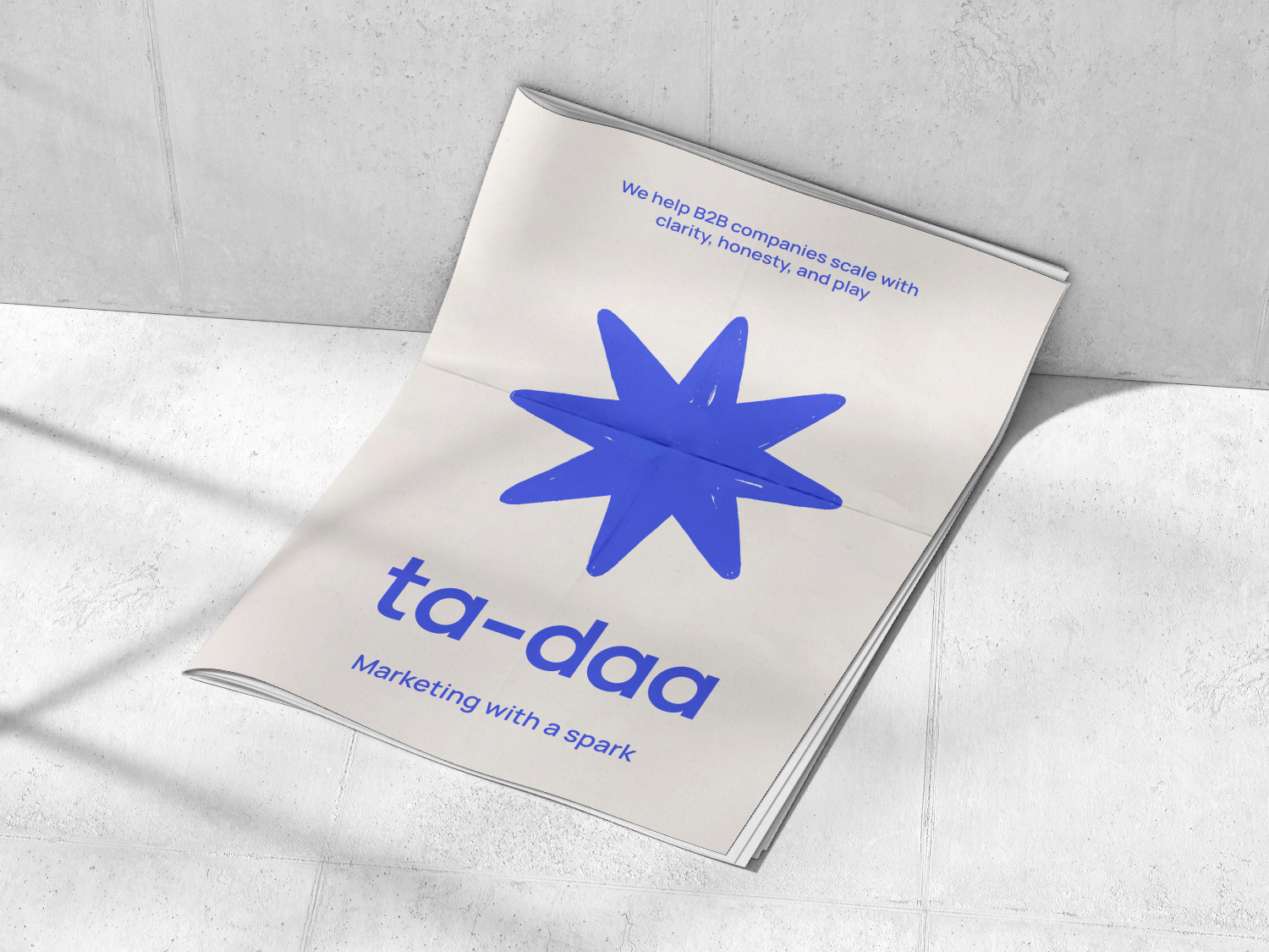
Brand logo
and identity
for a B2B marketing ecosystem
About the project
A brand created for a consultancy-turned-platform that helps entrepreneurs grow through marketing, automation, and radical clarity. It's not just about advice — it's an ecosystem where clients get real results, insight, and support to transform their businesses using marketing, analytics, and AI.

Brand’s mission
To help B2B companies scale with clarity, honesty, and play. The goal: double your inbound leads in 3 months — using strategy, data, and AI (not blind guesswork).


Clarity over chaos
We make the complex simple.
Clear strategy = confident action.
Core values
Results
No busywork. No vanity metrics. Just tangible outcomes.
Honesty
Straight talk only.
No hype, no manipulation.
Play
We don’t do serious faces and burnout vibes. We believe that joy and curiosity fuel great work.
Logo ::
Balanced with restraint and professionalism. For a tech platform operating in the B2B space, this is key.
The spark symbol ::
Imperfect, hand-drawn, full of life — a moment of insight, a “bingo!”. The spark allows the design to be scalable and flexible.
We don’t talk
At people —
we talk
With them


Serious results.
Not-so-serious vibes.

We help entrepreneurs amplify their missions through marketing, automation, and clarity.
This is not just consulting — it’s an ecosystem where clients gain tangible results, deep understanding, and support in transforming their business through marketing, data, and AI.

You’ll understand where to focus, what to do, and how to build and run your marketing. You don’t need a system — you need clarity. Because when you have clarity, you can build any system yourself. Otherwise, it's just another strategy and more Google Sheets collecting dust.
Fonts & Colors

Manrope Regular
Accent typography. Visual clarity. Swiss-style grid system.
Bright Blue
Primary accent :: Reliability and professionalism.
#4259FF
#F9F7F7
Milky White
Backgrounds, textures ::
Used as the primary base tone.
#2E2C2D
Deep Black
Text, interface elements :: Creates contrast against vivid accents.
#F5FF2F
Yellow Highlight
Spot accents :: A spark, an insight, a call for attention.
Daring details
don’t scare us

The logo may be structured and reserved, but this little character is its heartbeat. It quietly says: “Yes, we’re about strategy, analytics, and AI. But we’re also about joy.” It brings in the human spark — a reflection of the team’s energy and playfulness.


ABOUT ME
REELS
FILMS
PHOTOGRAPHY
youtube
email me


Brand logo and identity
for a B2B marketing ecosystem
About the project
A brand created for a consultancy-turned-platform that helps entrepreneurs grow through marketing, automation, and radical clarity. It's not just about advice — it's an ecosystem where clients get real results, insight, and support to transform their businesses using marketing, analytics, and AI.

Brand’s mission
To help B2B companies scale with clarity, honesty, and play. The goal: double your inbound leads in 3 months — using strategy, data, and AI (not blind guesswork).

Clarity over chaos
We make the complex simple.
Clear strategy = confident action.
Core values
Results
No busywork. No vanity metrics. Just tangible outcomes.
Honesty
Straight talk only.
No hype, no manipulation.
Play
We don’t do serious faces and burnout vibes. We believe that joy and curiosity fuel great work.

Logo ::
Balanced with restraint and professionalism. For a tech platform operating in the B2B space, this is key.
The spark symbol ::
Imperfect, hand-drawn, full of life — a moment of insight, a “bingo!”. The spark allows the design to be scalable and flexible.
We don’t talk At people — we talk With them
Serious results.
Not-so-serious vibes.

We help entrepreneurs amplify their missions through marketing, automation, and clarity. This is not just consulting — it’s an ecosystem where clients gain tangible results, deep understanding, and support in transforming their business through marketing, data, and AI.

You’ll understand where to focus, what to do, and how to build and run your marketing. You don’t need a system — you need clarity. Because when you have clarity, you can build any system yourself. Otherwise, it's just another strategy and more Google Sheets collecting dust.
Fonts & Colors

Manrope Regular
Accent typography. Visual clarity. Swiss-style grid system.
Bright Blue
Primary accent :: Reliability and professionalism.
#4259FF
#F9F7F7
Milky White
Backgrounds, textures ::
Used as the primary base tone.
#2E2C2D
Deep Black
Text, interface elements :: Creates contrast against vivid accents.
#F5FF2F
Yellow Highlight
Spot accents :: A spark, an insight, a call for attention.
Daring details
don’t scare us

The logo may be structured and reserved, but this little character is its heartbeat. It quietly says: “Yes, we’re about strategy, analytics, and AI. But we’re also about joy.” It brings in the human spark — a reflection of the team’s energy and playfulness.
ABOUT ME
REELS
FILMS
PHOTOGRAPHY
youtube
email me

Brand logo and identity
for a B2B marketing ecosystem
About the project
A brand created for a consultancy-turned-platform that helps entrepreneurs grow through marketing, automation, and radical clarity. It's not just about advice — it's an ecosystem where clients get real results, insight, and support to transform their businesses using marketing, analytics, and AI.

Brand’s mission
To help B2B companies scale with clarity, honesty, and play. The goal: double your inbound leads in 3 months — using strategy, data, and AI (not blind guesswork).
Clarity over chaos
We make the complex simple.
Clear strategy = confident action.
Core values
Results
No busywork. No vanity metrics. Just tangible outcomes.
Honesty
Straight talk only.
No hype, no manipulation.
Play
We don’t do serious faces and burnout vibes. We believe that joy and curiosity fuel great work.
Logo ::
Balanced with restraint and professionalism. For a tech platform operating in the B2B space, this is key.
The spark symbol ::
Imperfect, hand-drawn, full of life — a moment of insight, a “bingo!”. The spark allows the design to be scalable and flexible.
We don’t talk At people — we talk With them
Serious results.
Not-so-serious vibes.

We help entrepreneurs amplify their missions through marketing, automation, and clarity. This is not just consulting — it’s an ecosystem where clients gain tangible results, deep understanding, and support in transforming their business through marketing, data, and AI.

You’ll understand where to focus, what to do, and how to build and run your marketing. You don’t need a system — you need clarity. Because when you have clarity, you can build any system yourself. Otherwise, it's just another strategy and more Google Sheets collecting dust.
Fonts & Colors
Manrope Regular
Accent typography. Visual clarity. Swiss-style grid system.
Bright Blue
Primary accent :: Reliability and professionalism.
#4259FF
#F9F7F7
Milky White
Backgrounds, textures :: Used as the primary base tone.
#2E2C2D
Deep Black
Text, interface elements :: Creates contrast against vivid accents.
#F5FF2F
Yellow Highlight
Spot accents :: A spark, an insight, a call for attention.
Daring details
don’t scare us

The logo may be structured and reserved, but this little character is its heartbeat. It quietly says: “Yes, we’re about strategy, analytics, and AI. But we’re also about joy.” It brings in the human spark — a reflection of the team’s energy and playfulness.
ABOUT ME
REELS
FILMS
PHOTOGRAPHY
youtube
email me